HELP SAVE TONY!!!
About two years ago, I tried to get a pitch off the ground to re-introduce the old Tony the Tiger for his 50th birthday.
My great friends really helped out with the pitch and we got some wonderful art together.
So please, drop Leo Burnett (agency that has the Frosted Flakes account) a email and demand a commercial with the old Tony!
Thanks
Nate
THESE ARE NOT MY DRAWINGS..
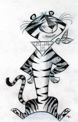
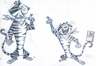
Craig Kellman...


Miles Thompson...
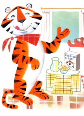
Lou Romano...
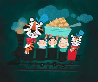
Conrad Vernon...
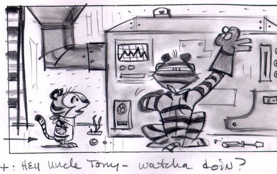
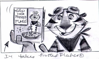
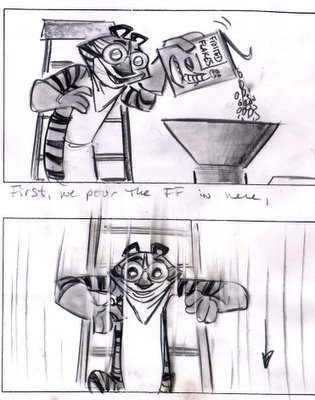
My great friends really helped out with the pitch and we got some wonderful art together.
So please, drop Leo Burnett (agency that has the Frosted Flakes account) a email and demand a commercial with the old Tony!
Thanks
Nate
THESE ARE NOT MY DRAWINGS..
Craig Kellman...


Miles Thompson...

Lou Romano...

Conrad Vernon...



24 Comments:
Wow, these are super cool! Too bad the idea didn't pan out.
Aw man...this is why Kellman is a design master. Super fun drawings.
That's unfortunate that they didnt run with your ideas. Tony could use a little spicing up. Cereal boxes would become collectible again, like the old Twinkles boxes.
Thanks for posting, Nate.
OH Wow! Wish they knew what they could have...
I think the designs are nice, but I can see why they said no. I could see Kelloggs doing some sort of limited edition reversible box, with the current design on one side, and the old one on the other.
I think it's so funny for Kelloggs to say no to the designer of Madagascar!
heh, some people dont no a good thing when they see it!
thanks for posting these!
REALLY interesting, thanks for posting the pitch designs too. I've thought for years now that Tony should be updated. Well done for approaching the agency.
Over here in the UK GUINNESS ale used to have a lovely TOUCAN mascot in the 50's & I always wanted the agency to bring him back. Recently they've been using it again on posters & bus stops but he'd be great animated too. Gotta find out which agency holds the Guinness account . . .
Man.. Those are great.. It's a shame they didn't go for it... very appealing designs.. thanks for sharing them..
I was at the Michael's Art Supplies store a few weeks back and noticed awesome "vintage" style tony the tiger post-its & magnets.
His "buddies" were also on magnets and pos-its as well.
They are all from 2005.
Each item = $1.00.
If ye really want 'em to stop using that crummy, unappealing version of Tony just tell them that there are certain groups of people online who find him more "sexually attractive" as a gross, muscley dick.
Man Kellman is just a PHENOMENAL designer. Thanks for posting these.
Really dig the work on your blog.
Fantastic work by all involved. Love it.
Where the heck do you guys find the time?! No, seriously--they are all gorgeous and it's shockingly uncool for LB not to want to jump on these designs.
I would bet a million bucks that with a new Provensenesque Tony on the box/ads, the darned things would fly out of the store. I'd buy them. Who wouldn't?
WOW . . .THESE ARE FANTASTIC. I'll drop a line man, you guys have created some wonderful stuff . . .bringing back the class.
MAC
I've always thought that the old Tony was way more appealling, and have often dreamt that the powers that be would get smart and change the way that he looks. I have to applaud you, Nate, for charging forward in this endeavor, but I must say that you may be barking up the wrong tree -- you must persuade Kellogg's since they are the client. Leo Burnett, no matter how influential they may be in the agency business, jump however high that Kellogg's tells 'em. Kellogg's is the client, and within that world of ad agencies and such, the client rules.
And considering the current ad campaign for the Tiger, they are all up in the extreme/power/energy thing right now, thus the pumped up Tony. It'll be a vast change to suddenly introduce a retro stylized Tony to these younsters -- one that Kellogg's may not be so willing to endure.
But OH! I'd love to see that cool Tony, though! I'm with you 100% in this, and hey -- maybe with enough persuasion, you can indeed turn the tide with Big K to change their minds about their current lame design for Tony the Tiger. What you have here is fantastic.
Best of luck!
This comment has been removed by a blog administrator.
Hi Nate,
Really enjoyed your blog, great colour styling.
You must succeed in this campaign, this MUST happen, these designs are more than terrific, they're (and I can't believe I'm the first to write this) gggrrreeeaattt!!
I'm nothing if not obvious.
-WK
p.s. When's Kellman going to start a blog? He's one of the few left who hasn't.
Ward is right in his comment about agencies. The client has to push the idea. They need to make a spot for late prime viewing with retro Tony targeting boomers with the munchies.
This comment has been removed by a blog administrator.
All that Kellogg’s cares about is selling cereal! It is the Agency’s job that tells them how to promote and
sell more box's !
The Agency Throws out Ideas and then Kellogg’s picks a route .
Been doing this for a Long time .
But thanks for checking out the blog and keep comin back Guys
also thanks for all your comments
Nate
Hi Nate! I just found out about your blog and your campain to restore the real Tonny Tiger. Good for ya! Too bad the people of Leo Burnett rejected the idea. I agree with Ward but also with you in how to aproach this. I think we can combine both ideas. We can try to persuade both the AD agency as well as Kellog's. I remember when Coca Cola changed their formula to make it taste similar to Pespi and this one guy orquestrated a campain to convinced the Coca Cola company to get back to the old formula. So, maybe you guys are both right! Let's make pressure to both Leo Burnett and Kellog's.
I also want to take the oportunity to thank you for posting those absolutelly beautiful designs!! Gorgeous!!!
I remember you and Lou when you guys were at Turner working on The Page Master. I saw you later at Renegade when I went there for some freelance.
I'm also glad to find out that I'm not the only one that is that crazy about Tonny Tiger. I even got my very own "retro style" Tonny Tiger cereal bowls!!
Good luck with everything!!
I got to work on Tony animation with ex-Disney artists Bob Carlson and Larry Kilty as an in-betweener in Santa Cruz CA area in the 1970's! Animation was matched with live action peged 8x10 b/w film frames.
good info
Great work everybody! I love all the artwork.
I dropped LB a line myself. Every little bit helps!
Jeff
Post a Comment
Subscribe to Post Comments [Atom]
<< Home